WeCanManage
WeCanManage is an accessible remote health intervention designed to support cancer survivors with disabilities on their path to redefining life after cancer. The web app empowers survivors by providing them with guidance and resources to navigate the complexities of life after treatment. WeCanManage will equip survivors with the knowledge and tools they need to effectively manage their health, improve their quality of life, and thrive in their communities.
-
Marvel, Maze, Miroboard, Canva, Figma, Asana, Google Suite, Ballpark
-
Designer, Researcher, Workshop Leader, Team Coordinator
-
Literature Review, Iterative Design, Task Management, User Interview, Heuristics, Usability Testing
Problem
Inadequate Support for Cancer Survivors Beyond Treatment
The transition from active treatment to long-term cancer survivorship leaves the needs of many cancer survivors unaddressed as they struggle with physical, cognitive, psychological, and social consequences of cancer and its treatment. The lack of guidance after treatment has forced cancer survivors to manage long-term effects on their own, which has an impact on their overall health, quality of life, and social participation.
Solution
Empowering Survivors with Digital Self-Management Tools
WeCanManage is a self-management web app intervention developed to empower cancer survivors to take charge of their lives after treatment.
The intervention integrates problem-solving, mindfulness, and self-advocacy to boost self-efficacy in managing cancer as a chronic condition, delivered via mobile micro-learning modules over four weeks.
We recruited five cancer survivors, whom we call survivor scientists, to collaborate with our interdisciplinary team. Together, through a series of workshops and testing, we crafted a web application with their invaluable insights.
Our Process
Research
Test
Design
Outcome
Redesign
Persona Development
Our Process
Persona Development
Ideation
Mockup
Initial Prototype
Heuristics
Refinements
Usability Testing
Final Design
Persona Development
Understanding Survivors
We introduced Liz and Solomon, two fictional characters based on 25 qualitative interviews with survivors of breast, sarcoma, and head and neck cancer. To encourage deeper connection, we presented these personas without images, inviting survivors to imagine and complete their stories.
Together, we explored the challenges Liz and Solomon might face. Then, we asked survivor scientists to help us prioritize these challenges, ensuring our efforts would truly address the most pressing needs of the community.
By understanding Liz and Solomon's experiences, we gained valuable insights into the everyday struggles of cancer survivors. This helped us focus on building something useful and meaningful for them.


Key Challenges Identified
Loneliness and Isolation: Feeling disconnected from others, lacking social support, and experiencing a sense of aloneness.
Financial Strain: Dealing with high medical costs, loss of income due to treatment, and difficulty affording daily living expenses.
Mental Health Struggles: Experiencing anxiety, depression, and other mental health issues as a result of the cancer diagnosis and treatment.
Difficulties with Work and Leisure: Challenges in returning to work, maintaining a work-life balance, and engaging in hobbies and activities due to physical or emotional limitations.
Navigating Changes in Social Roles: Adapting to new roles and responsibilities within family and social circles after a cancer diagnosis.
Ideation
Understanding Preferences
We wanted to uncover the features cancer survivors appreciate in current apps. They shared their likes and dislikes in the Zoom chat, focusing on design aspects. We then used their input to create a word cloud, giving us a visual snapshot of their preferences.
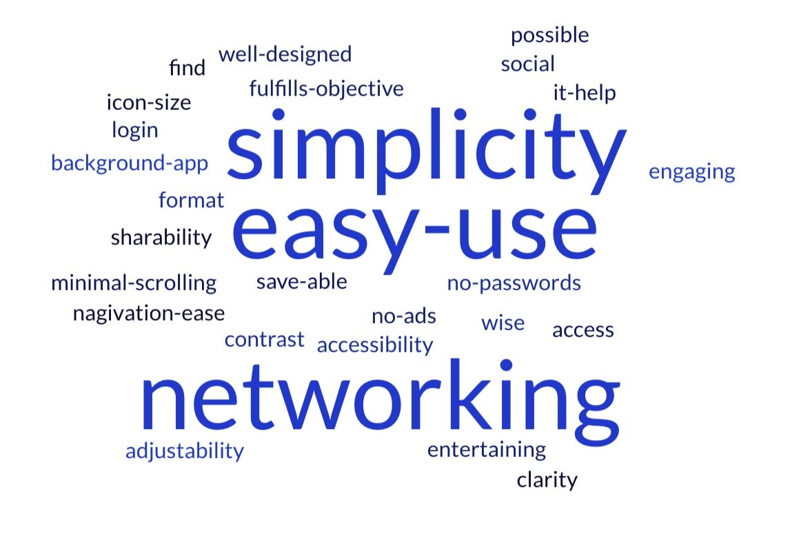
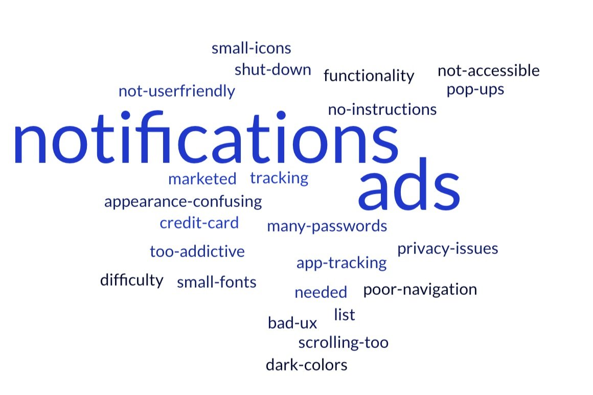
Design Considerations
Simple and Intuitive Interface: Users prioritize ease of use and simplicity. The app should be user-friendly and avoid unnecessary complexity.
Minimal Distractions: Users dislike excessive notifications and ads. The app should prioritize a clean and distraction-free experience.
Strong Social Focus: Networking is a highly desired feature, indicating a strong need for social connection and peer support within the app.
Sketching Ideas
We collaborated with survivor scientists, encouraging them to dream big and envision an ideal app. Even though there were limitations in terms of what we could technically achieve and afford, we urged the survivor scientists to envision a world without boundaries. We sketched out their ideas on a Miro whiteboard and used Slido to help them prioritize the most important features.


Priority Features
Customization & Personalization: Survivors sketched a personalized learning path with stars and emphasized diversity represented in images.
Ease of Use & Navigation: Intuitive navigation, searchable content, and the ability to bookmark content were key.
Accessibility: Accessibility for all users, including those with varying tech skills and disabilities, was crucial. They also suggested diverse learning modes.
Minimal Design: A clean interface was preferred, but with more color and engaging content.
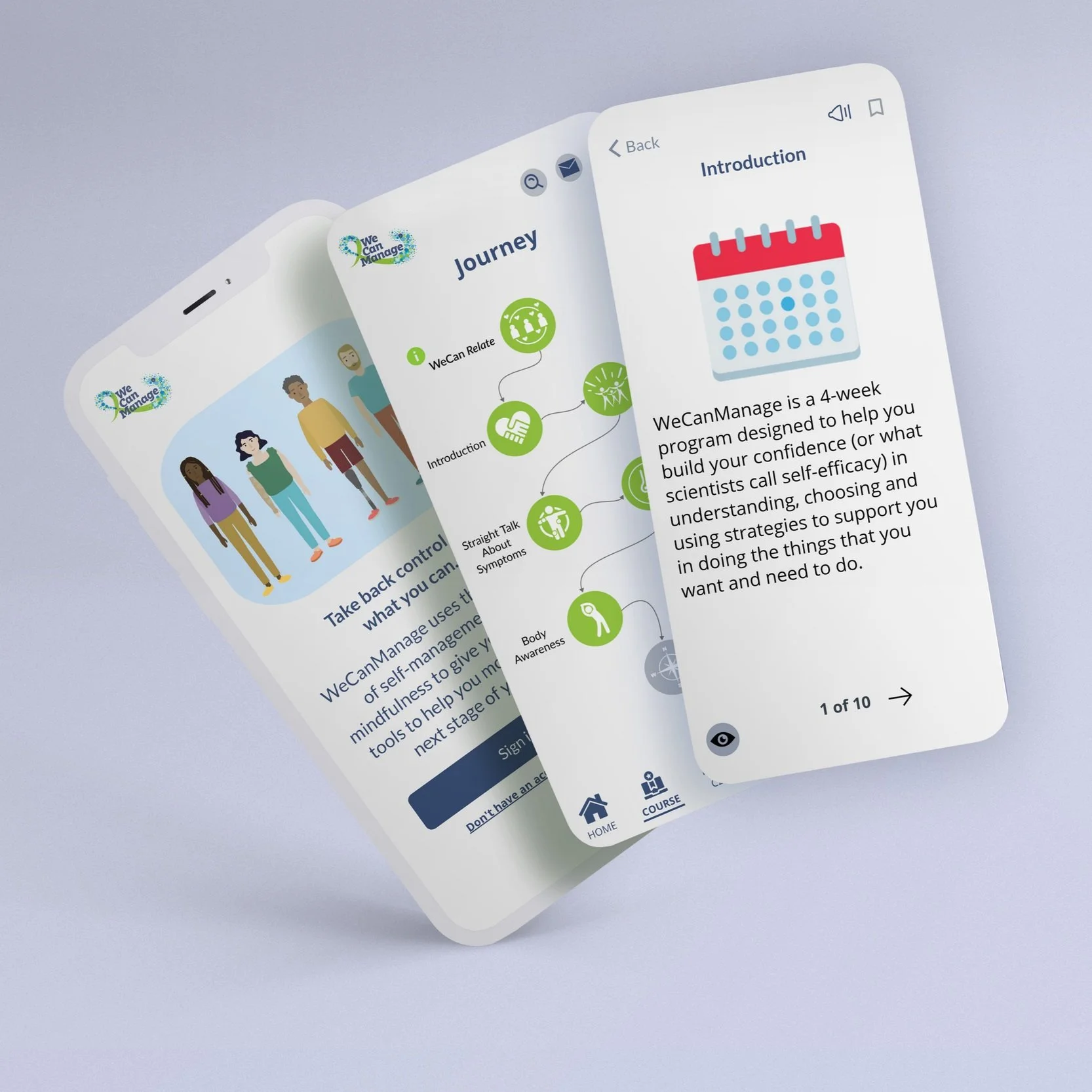
Mockup
Prioritizing Accessibility
We created the mockup with accessibility in mind. To reach the widest audience, we developed a web app that offers a mobile-like experience, accessible across both desktop and mobile browsers. This approach was chosen to maximize reach while staying within budget and avoiding platform limitations.


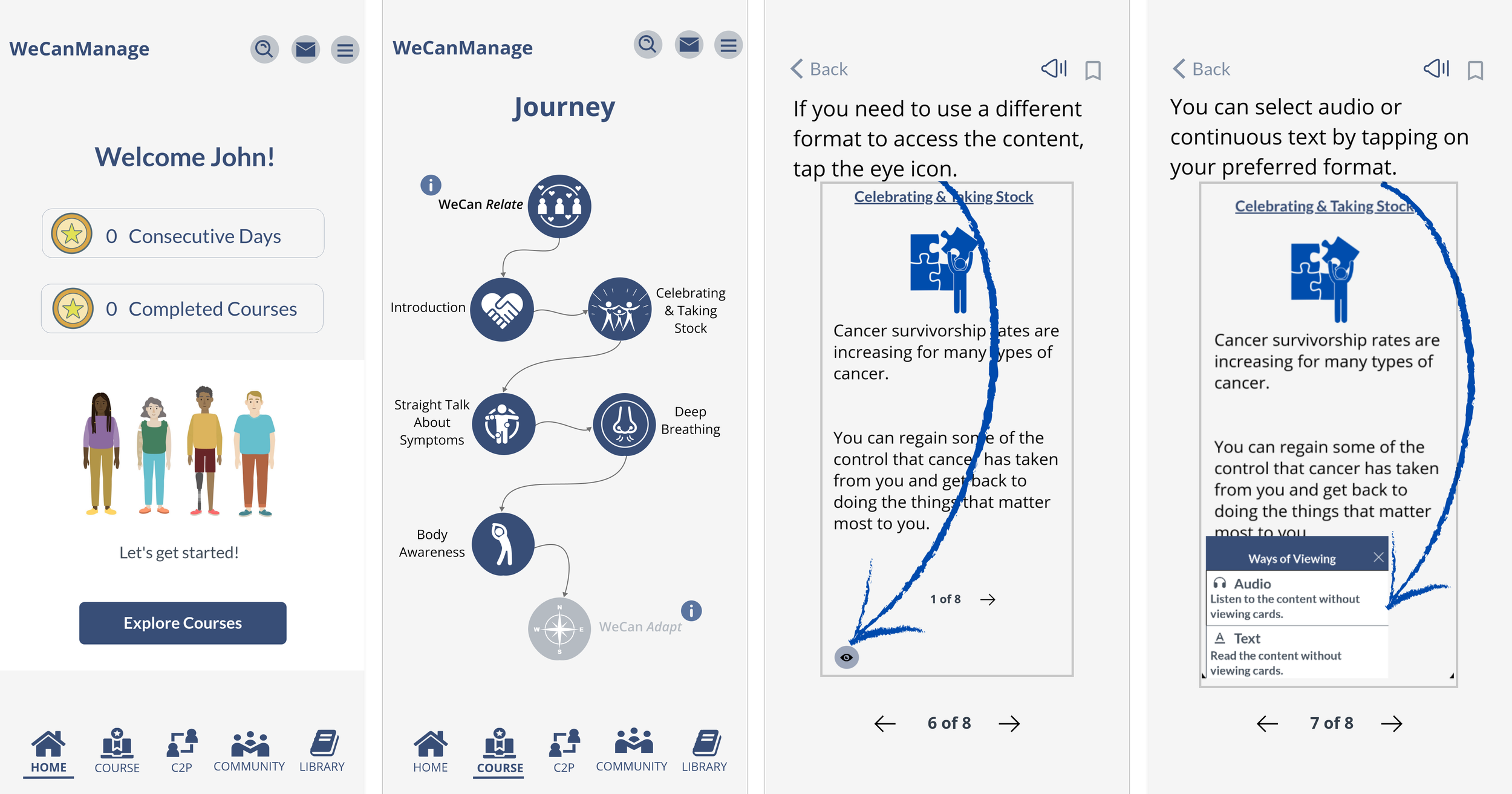
Key Interaction Moments
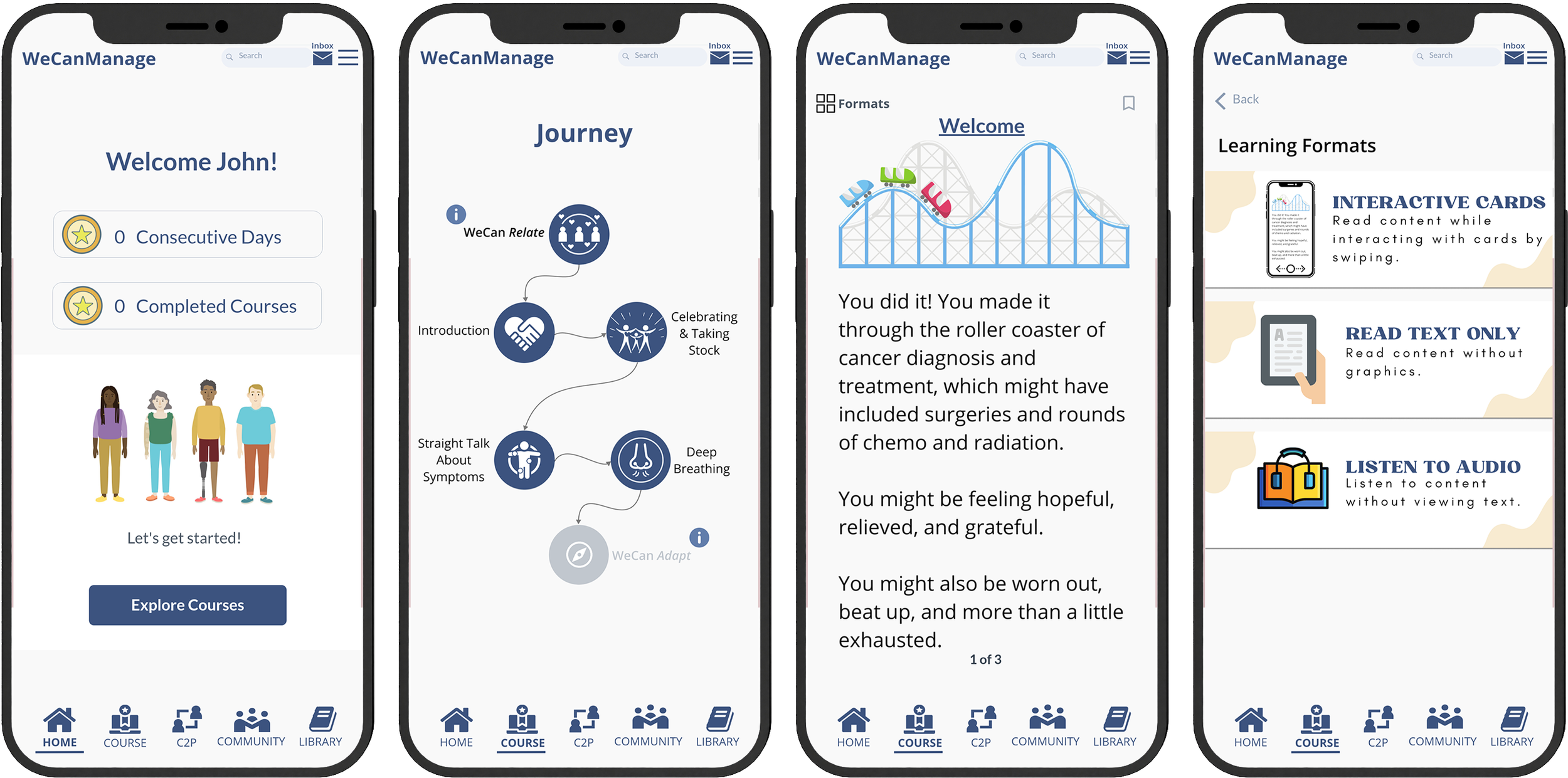
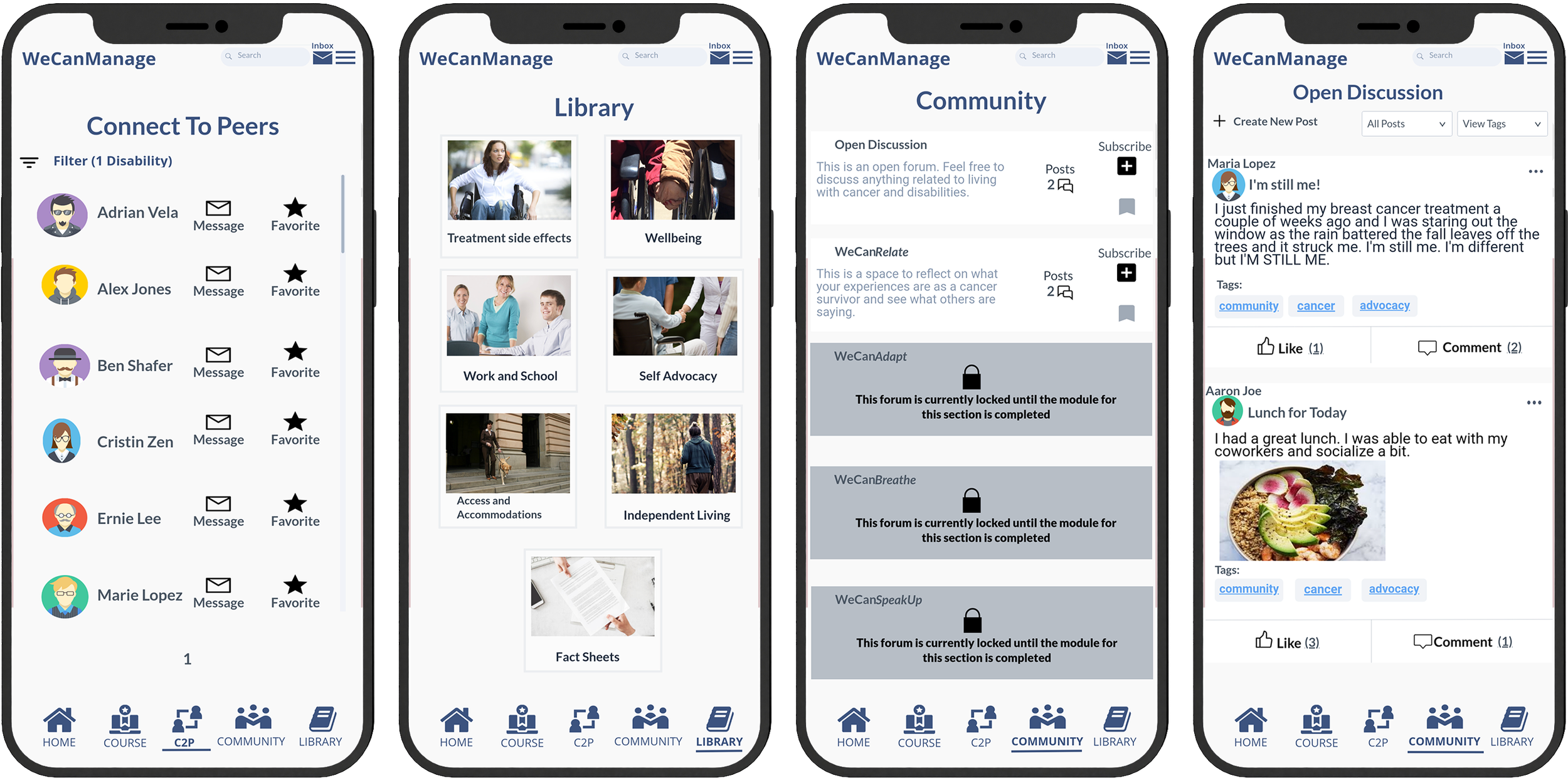
Pages
The wireframe consisted of several pages including:
Home - The landing page features a personalized goal, practice minutes, consecutive days practiced, courses completed, and a button to access the courses tab.
Course (Journey) - This section consists of micro-lessons divided into four categories.
C2P (Connect to Peers) - C2P offers users a space to expand their network and connect with other cancer survivors through direct messaging.
Community (Community Forum) - Users can share their experiences and provide mutual support.
Library - This section houses various helpful resources.
Content
When logging into a course, the users will be offered a series of micro-lessons subdivided into 4 content modules:
WeCanRelate seeks to normalize and validate their experiences as survivors.
WeCanAdapt focuses on problem-solving–based self-management skill building to promote self-efficacy.
WeCanBreathe introduces mindfulness-based practices.
WeCanSpeakUp addresses self-advocacy skills as well as disability and survivor rights.
Content will be provided in different viewing formats: interactive cards, animated video, readable text, and audio.
Initial Prototype
Web-App Design
The high-fidelity prototype was created on Marvel, a web-based collaborative design platform. We set out to create WeCanManage as a web application that looks and feels like a mobile app.
Feedback from several workshops led to changes in the icons for the Navigation Bar, a redesign to the Home and C2P pages, and font size adjustments. A 'Formats' button and screen were added to change the viewing of the learning modules in the Courses section.
Heuristic Evaluation
Identifying Heuristic Violations
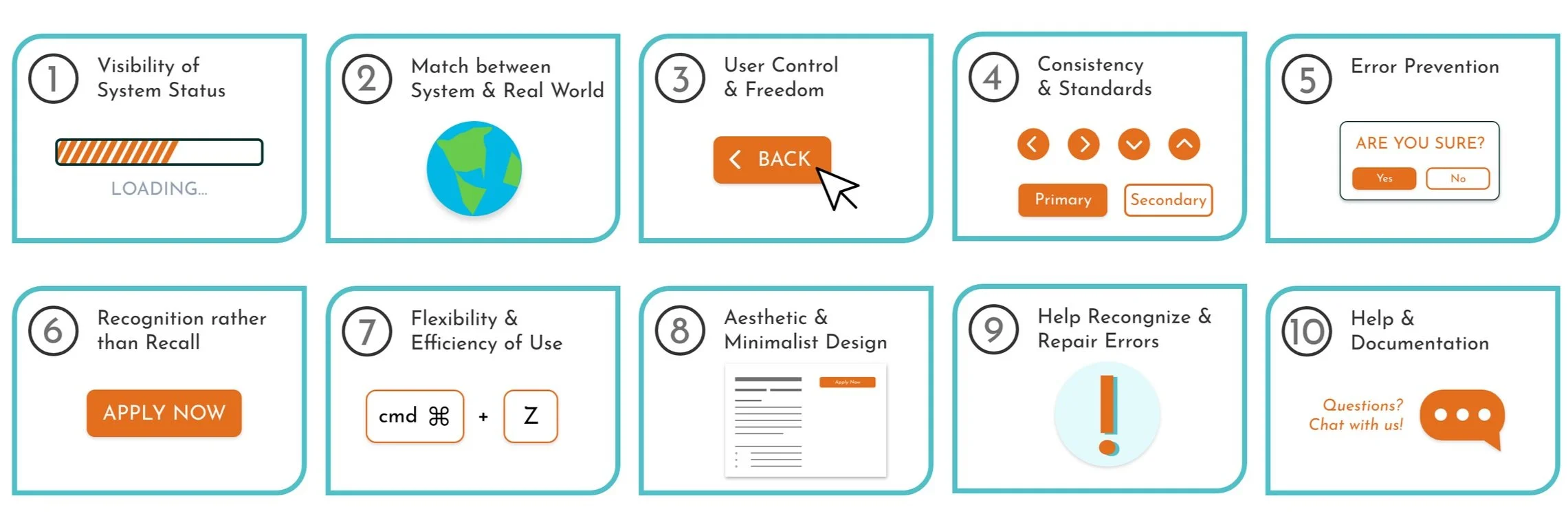
We wanted to identify potential issues in the prototype prior to user testing, so we invited 22 Human Computer Interaction students to evaluate it. They worked in groups of three to five, using Nielsen's heuristics to find any usability problems. Each group identified at least three issues and gave them a severity rating, helping us understand where we needed to make improvements.
Identified Challenges: Navigation, Accessibility, and User Support
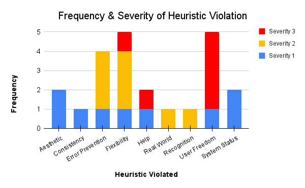
Content Navigation Challenges: Difficulty navigating cards within courses due to unclear swipe indications and missing back buttons.
Navigation Overload: Too many options in the top navigation bar created confusion.
Accessibility Concerns: Viewing formats within courses were difficult to locate.
Help Guides were requested: Users requested help guides for help with navigation within the Courses page.
Prototype Refinements
Creating a Smoother Experience
We learned a lot from Heuristics testing. It helped us spot some areas where things weren't quite working as smoothly as they could. So, we focused on addressing these issues and made some changes. We made all these tweaks to get the app ready for more in-depth testing with users.
Design Refinements
Through heuristic testing, we identified opportunities to refine the user journey. To enhance clarity and ease of use, we made targeted adjustments: top-navigation bar was redesigned, font sizes were increased for readability, back buttons were thoughtfully integrated, and the 'Formats' button was transformed into an 'Eye' icon, aiming for a more intuitive visual cue.
User Inspired Features
To further enhance navigation and provide immediate user support, we implemented a user-friendly help guide within the prototype. This feature empowers users to independently navigate the application and readily access accessibility features, minimizing frustration and maximizing efficiency.
A Closer Look At The Updates

Usability Testing
Testing & Data Collection
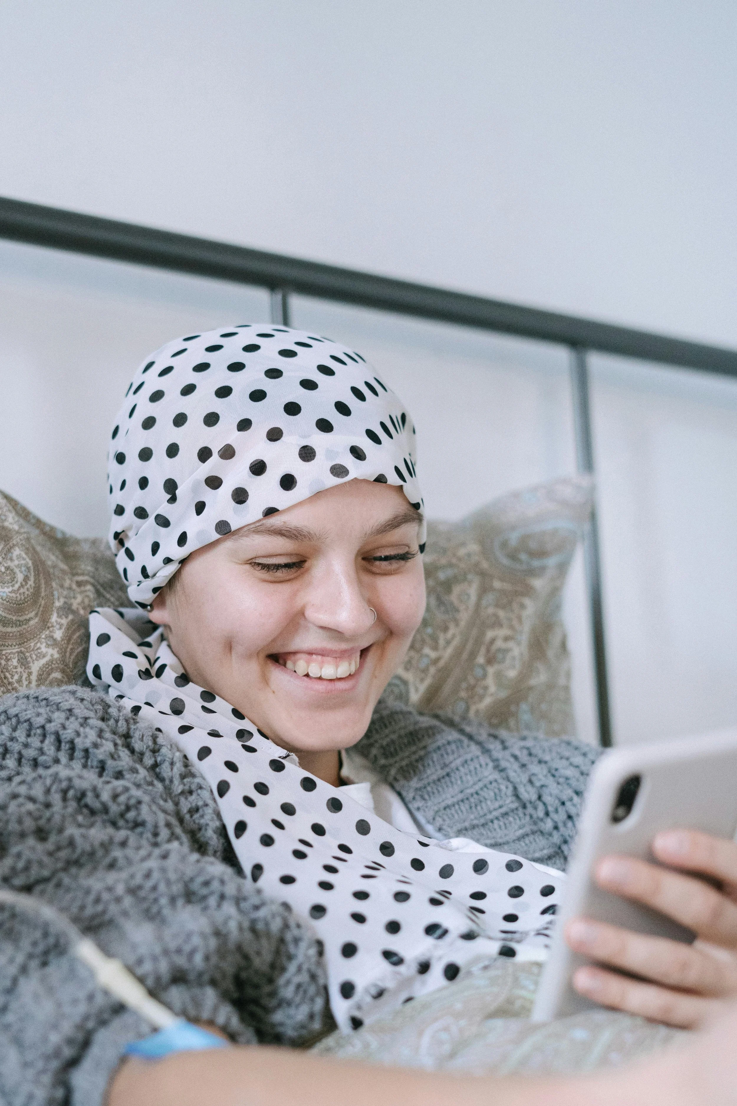
We recruited participants from cancer survivorship networks (both clinical and community) to independently assess the app's usability by completing eight assigned tasks, simulating day 6 of a 4-week period.
We used a combination of qualitative and quantitative methods to gather feedback on participant satisfaction.
Participants rated Task Time and Ease on a 7-point Likert scale (1 = Strongly Disagree & 7 = Strongly Agree), completed a System Usability Scale (SUS) Questionnaire, and shared Open-Ended Feedback.
Additionally, we had two independent coders review each recording and categorize participant performance into separate categories (C,L,H) to evaluate the app design's effectiveness.
Task Time & Ease Questions:
Overall, I am satisfied with the ease of completing this task.
Overall, I am satisfied with the amount of time it took to complete this task.
Open Ended Questions:
What did you like most from the app? Why?
What did you like least? Why?
How easy or difficult was it to see all the content on the screen?
What did you think of the design of the course modules?
What could we do to improve this app?
Participant Performance:
Categorizing participants' task completion into three groups:
Completed quickly on their own (C)
Completed alone though it took a little more time (L)
Required assistance to complete the task (H).
App Receives Positive Reviews
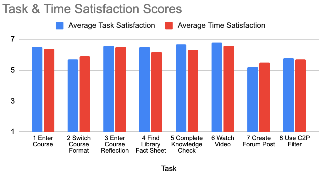
Overall, our results suggest that participants were pleased with the app.
Task Satisfaction:
High User Satisfaction: On average, users were satisfied with the ease and speed of completing tasks.
Top-Performing Tasks: Five out of eight tasks received high satisfaction ratings (above 6 out of 7) for both ease and completion time.
Areas for Improvement: Tasks 2, 7, and 8 required more effort and attention, indicating potential areas for optimization in the user interface and task design.
Open Ended Questions:
Positive Feedback: Participants were generally satisfied with the overall design, layout, and specific features like the Help Guide, Course Videos, and the Community and Library pages.
Accessibility Recommendations:
Increase font sizes and enlarge icons for better readability.
Participants expressed a desire for an easy way to return to the help guide.
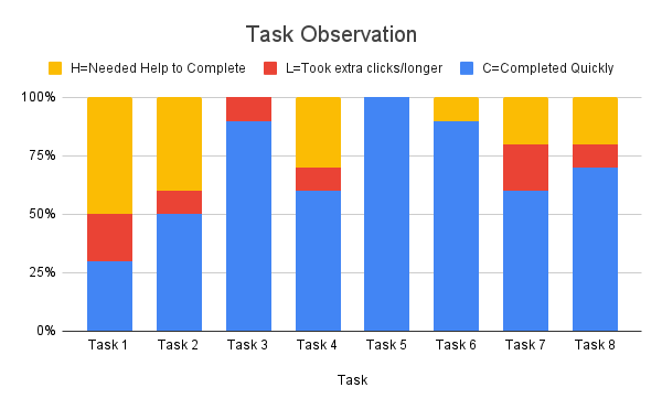
Participant Performance:
Overall, most participants completed their tasks without any issues, with only 17 out of 80 cases (21%) needing help to complete them. Many of which could be easily solved by improving button visibility.
System Usability:
SUS Score: Participants responded positively to the prototype's design, achieving an average SUS score of 81, indicating excellent usability and placing it in the top 10%.
Final Design
Increased visual clarity: Margins, font, and icon sizes were increased throughout the prototype.
Improved button visibility: Buttons like "Create New Post" in Community, the “Eye” in Courses, and "Filter" in C2P were made more prominent.
Enhanced Community: The "Like" button was replaced with "react" to encourage positive interaction.
Refined Help Guide: The help guide was refined for better clarity and made easily accessible via the hamburger menu.
Enhanced library organization: Library resources were reorganized and section titles were updated for improved clarity.
Visual Identity: The WeCanManage logo was created by a Survivor Scientist on our team, bringing their design expertise to the project.
WeCanManage


Lessons Learned
A key focus of this project was understanding our users' needs and translating their vision into a successful product. My role involved ensuring that user feedback was central to every stage of the design process, while also adhering to project constraints and budget. I was able to help teams make quick decisions and keep the conversation flowing. I also worked closely with the engineering team, ensuring our shared vision was clearly understood and that we anticipated and addressed potential challenges.
It was amazing to see this project grow from a small idea into a successful project that's actually going to be used by our users. I learned so much about how to work effectively with different teams, communicate clearly, and keep things moving forward. I'm really proud to have been part of this team and to have helped make this happen.