mENTER
mENTER is a digital tool that empowers “Peer Navigators” to provide more effective support to individuals with new disabilities. By streamlining processes and enhancing communication, mENTER helps Navigators and their peers better coordinate care, track progress, and address challenges remotely. This innovative approach improves access to support services, reduces barriers to independent living, and ultimately empowers individuals to thrive in their communities.
Tools
Miroboard, Canva, Figma, Google Suite, Zoom
Role
Team Designer, Researcher, Workshop Leader, Mentor
Skills
Literature Review, Iterative Design, User Interviews, UX Evaluations, Heuristics Testing
Problem
Support Services Out of Reach for Newly Disabled People.
Many newly disabled people struggle to access in-person peer navigator support because of distance, mobility issues, or limited program availability. Without the right support, they can feel isolated and overwhelmed, missing out on the valuable guidance peer navigator programs can offer. Existing support systems struggle with coordinating care and communication, making it harder for Navigators and their Peers to track progress and provide the timely, personalized support individuals need.
Solution
Empowering Success Through Remote Peer Support
mENTER is a mobile app designed to help people with disabilities transition back into their communities. The app's collaborative workspace facilitates goal setting, action planning, and resource identification.
mENTER was developed through a collaborative partnership between an interdisciplinary team and individuals with disabilities, serving as Peer Navigators. Their lived experience and expertise were crucial in shaping the app and ensuring it meets the real-world needs of people navigating community life.
Our Process
Persona Development
Mockup
Hi-Fi Prototype
Focus Group Testing
Final Design
Persona Development
Understanding Peers
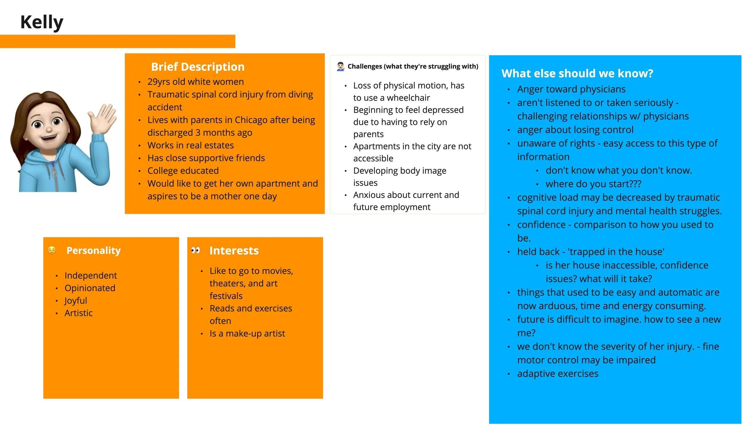
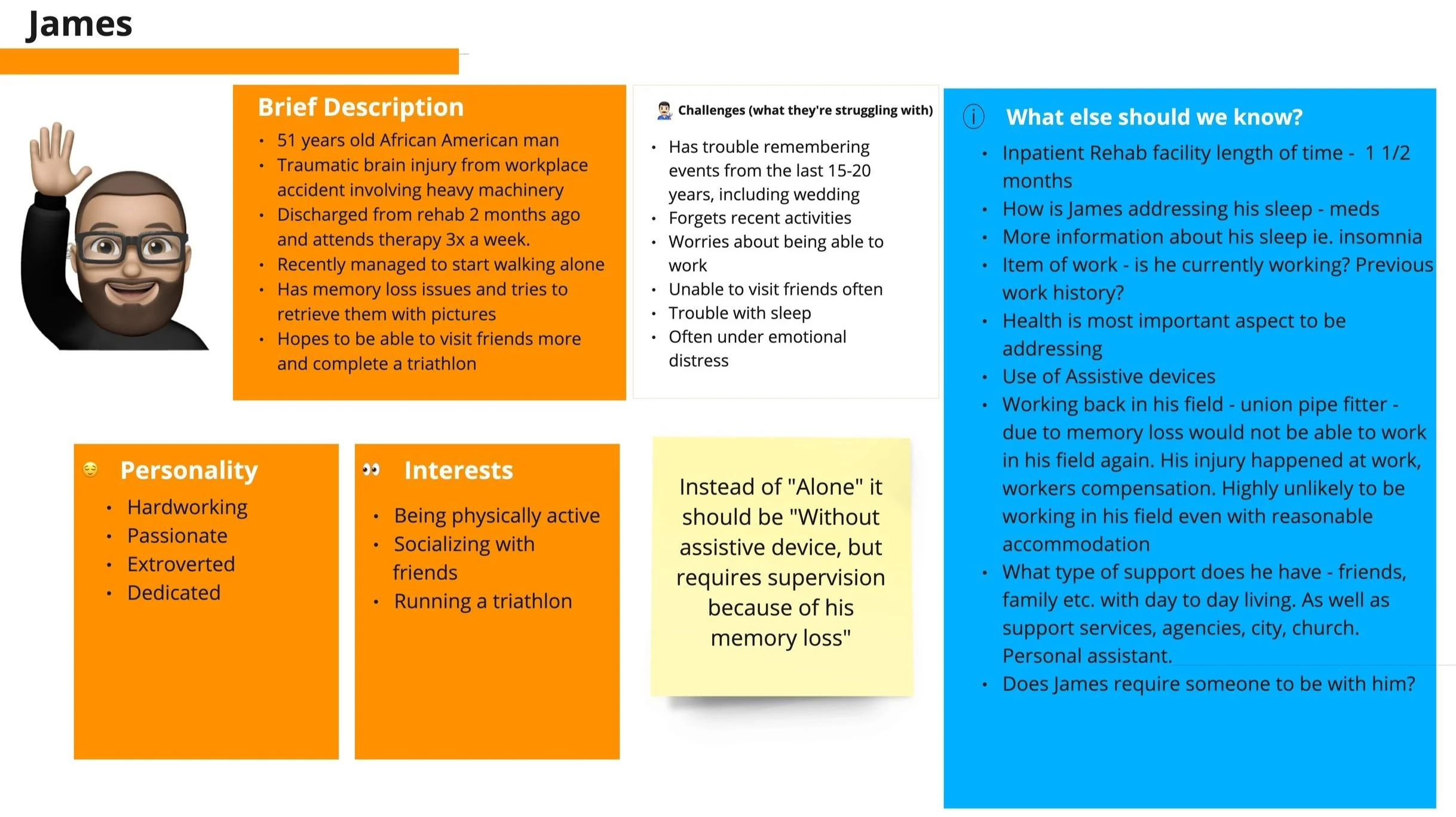
Peer Navigators were presented with two partially developed “peer personas”, Kelly and James.
Discussions explored traits, daily routines, and the impact of disability to identify their unique support needs.
The personas we created laid the groundwork for designing with empathy and crafting additional support tools for this community.
Essential Ingredients for Peer Success
Emotional Wellbeing and Support: We needed to provide individuals with one on one peer support and create a safe space for healing and personal growth.
Accessibility and Advocacy: Ensuring access to information, resources, and accommodations to empower individuals to navigate systems like healthcare or employment, advocating for their rights effectively.
Identification of Support Network and Resources: Strengthening connections with family, friends, and community-based services for day-to-day assistance.
Empowerment and Self-Confidence: Encouraging individuals to set achievable goals and celebrate progress.
Mockup Phase
Understanding the Vision
We collaborated with peer navigators to align the app's design with their vision, focusing on features like goal tracking, action planning, and resource mapping. Insights from their strategies and worksheet processes guided us in creating mockups using Miro, an online white-board platform.
Key Interaction Moments
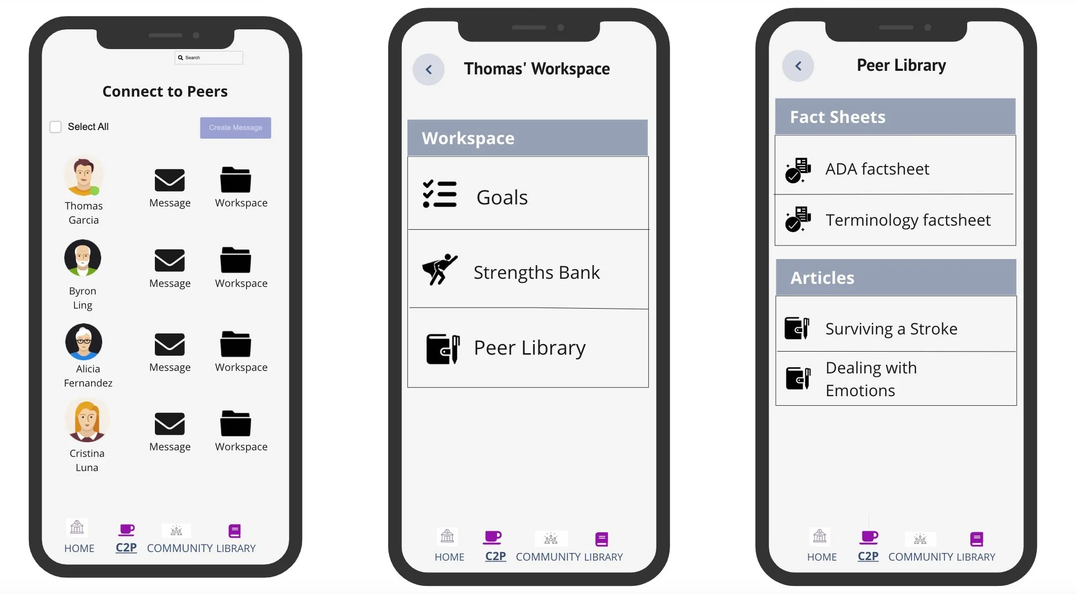
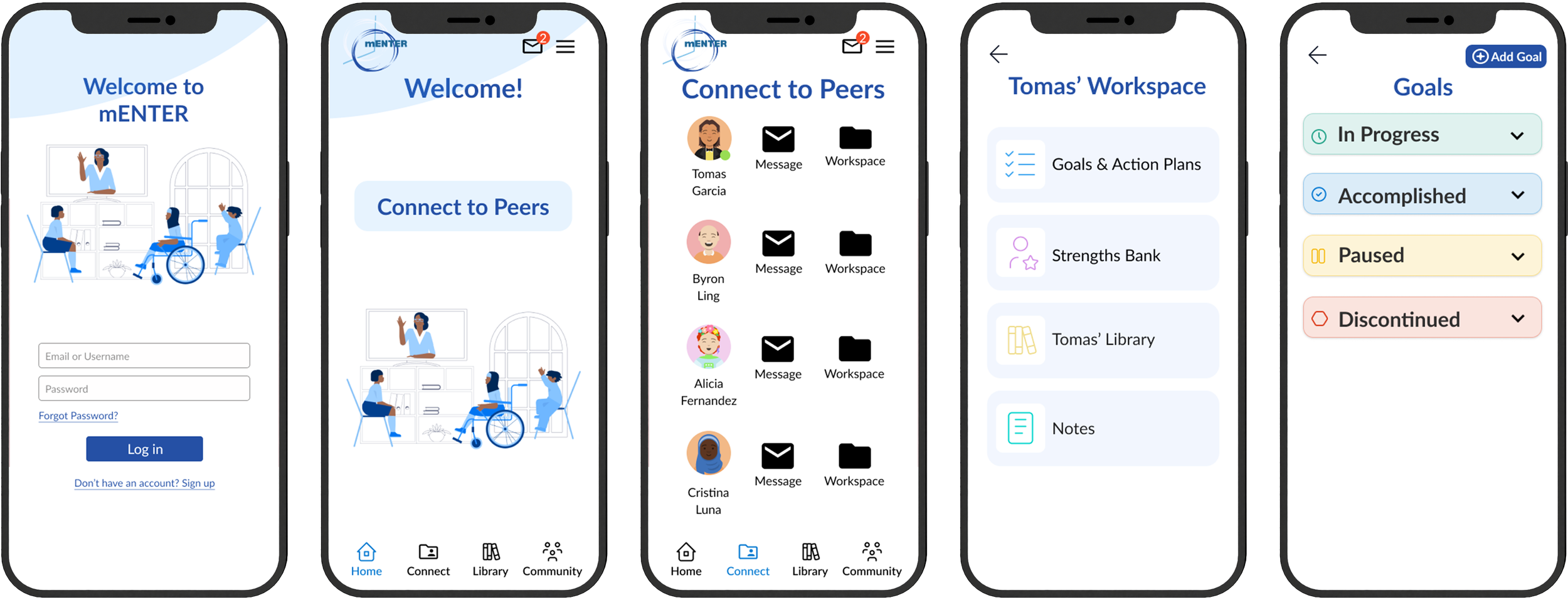
Connect to Peers (C2P): A list of peers with options for individual or group messaging and a workspace to track goals, strengths, and resources.
Workspace: A hub for managing a peer’s goals, strengths, and library.
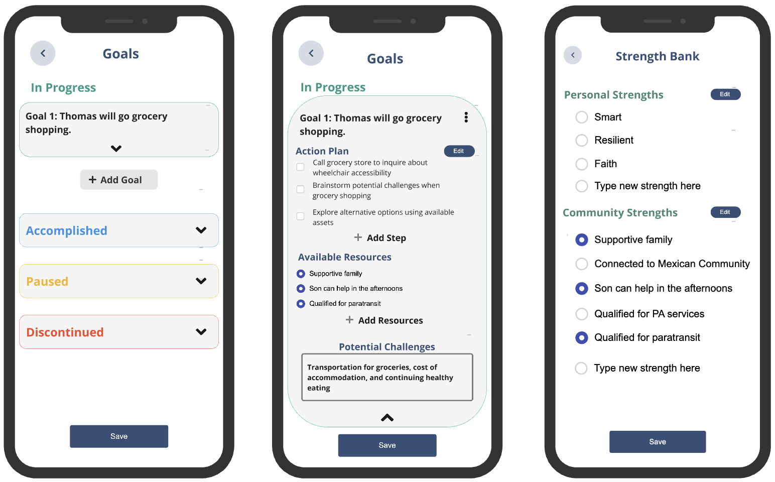
Strengths Bank: A space to record each peer’s strengths and resources.
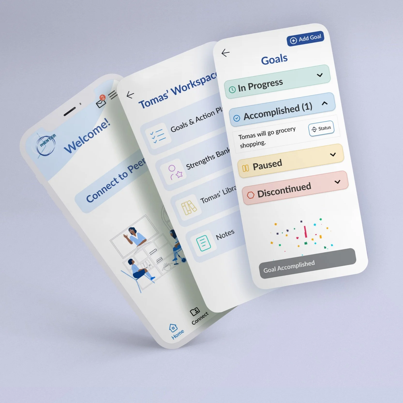
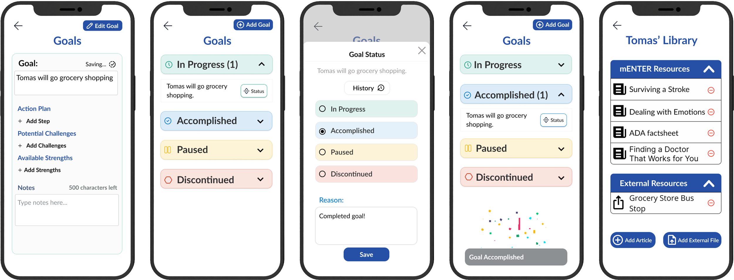
Goals Section: A place to track goals, mark progress, and link related action plans, resources, and challenges.
Peer Library: A collection of articles and fact sheets tailored to each peer.
Community: A forum for sharing experiences with others in similar situations.
Library: A resource hub of evidence-based articles, videos, and fact sheets that can be added to individual peer libraries.
Hi-Fi Prototype
Initial Design
We took everything we learned from the mockup phase and from various co-design workshops to build a high fidelity prototype. We fixed the parts that were confusing and made sure it included the items and features they wanted. These changes prepared the app for further testing with a focus group.
Design Refinements
We gave the Navigation Bar a makeover with new labels and icons, smoothed out the Workspace, and made the Goals and Strength Bank sections more straightforward. We also adjusted the font sizes so everything's much easier to read.
User Inspired Features
“Help Guides” were implemented and an intro tutorial was included for new users.
A Closer Look At The Updates


Focus Group
Testing & Data Collection
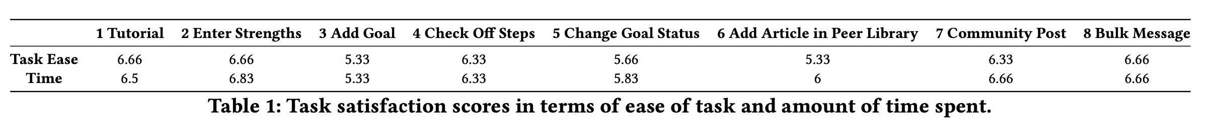
We asked Peer Navigators to independently assess the app's usability giving them 8 tasks to complete.
We used a combination of qualitative and quantitative methods to gather feedback on participant satisfaction.
Participants rated Task Time and Ease on a 7-point Likert scale (1 = Strongly Disagree & 7 = Strongly Agree) and shared Open-Ended Feedback.
Task Time & Ease Questions:
Overall, I am satisfied with the ease of completing this task.
Overall, I am satisfied with the amount of time it took to complete this task.
Open Ended Questions:
What features did you like?
What features did you dislike?
What did you think of the design for adding goals and action plans?
Any improvements we should make?
Any other feedback for us?
App Receives Positive Reviews
Overall, our results suggest that participants were pleased with the app.
Tasks:
High User Satisfaction: On average, users were satisfied with the ease and speed of completing tasks.
Top-Performing Tasks: Five out of eight tasks received high satisfaction ratings (above 6 out of 7) for both ease and completion time.
Areas for Improvement: Tasks 3, 5, and 6 required more effort and attention, indicating potential areas for optimization in the user interface and task design.
Open Ended Questions:
Positive Feedback: Participants were generally satisfied with the overall design, layout, and specific features like Connect, Community, Notes, and goal-setting.
Accessibility Recommendations:
Improve color contrast, especially for elements like "Paused" status.
Increase font sizes for better readability.
Enlarge clickable areas.
Final Design
Beyond implementing the accessibility recommendations, the following key improvements were made:
Improved Navigation: The navigation bar was simplified to reduce clutter and improve user experience.
Improved Goal Section: A more visible button for adding goals was added and a “status” button was implemented to move goals.
Improved button visibility: The “Add Article” button was made more prominent.
mENTER
Lessons Learned
We worked closely with peer navigators to design mENTER. By listening to their experiences and challenges, I was able to put myself in their shoes to understand their perspective and build a more inclusive and user-friendly app.
While I learned a lot from their feedback and improved the design, I realized that some parts of the task scenarios during usability testing were too complex. In the future, a simplified approach, breaking down tasks into smaller, more manageable steps, would make it easier to process, especially for people with cognitive impairments.
This project has been a valuable learning experience, demonstrating the power of user-centered design and the importance of involving end-users throughout the development process. I am proud of the mENTER app and excited about its potential to positively impact the lives of many.